
Tourcabs
A modern, energetic and trustworthy identity for a cab service brand that represents travel, movement and reliable transportation. The logo needed to communicate the idea of touring, navigation and discovering new destinations while remaining bold and easily recognisable.

- 01
Brief
A modern, energetic and trustworthy identity for a cab service brand that represents travel, movement and reliable transportation. The logo needed to communicate the idea of touring, navigation and discovering new destinations while remaining bold and easily recognisable.
- 02
Approach
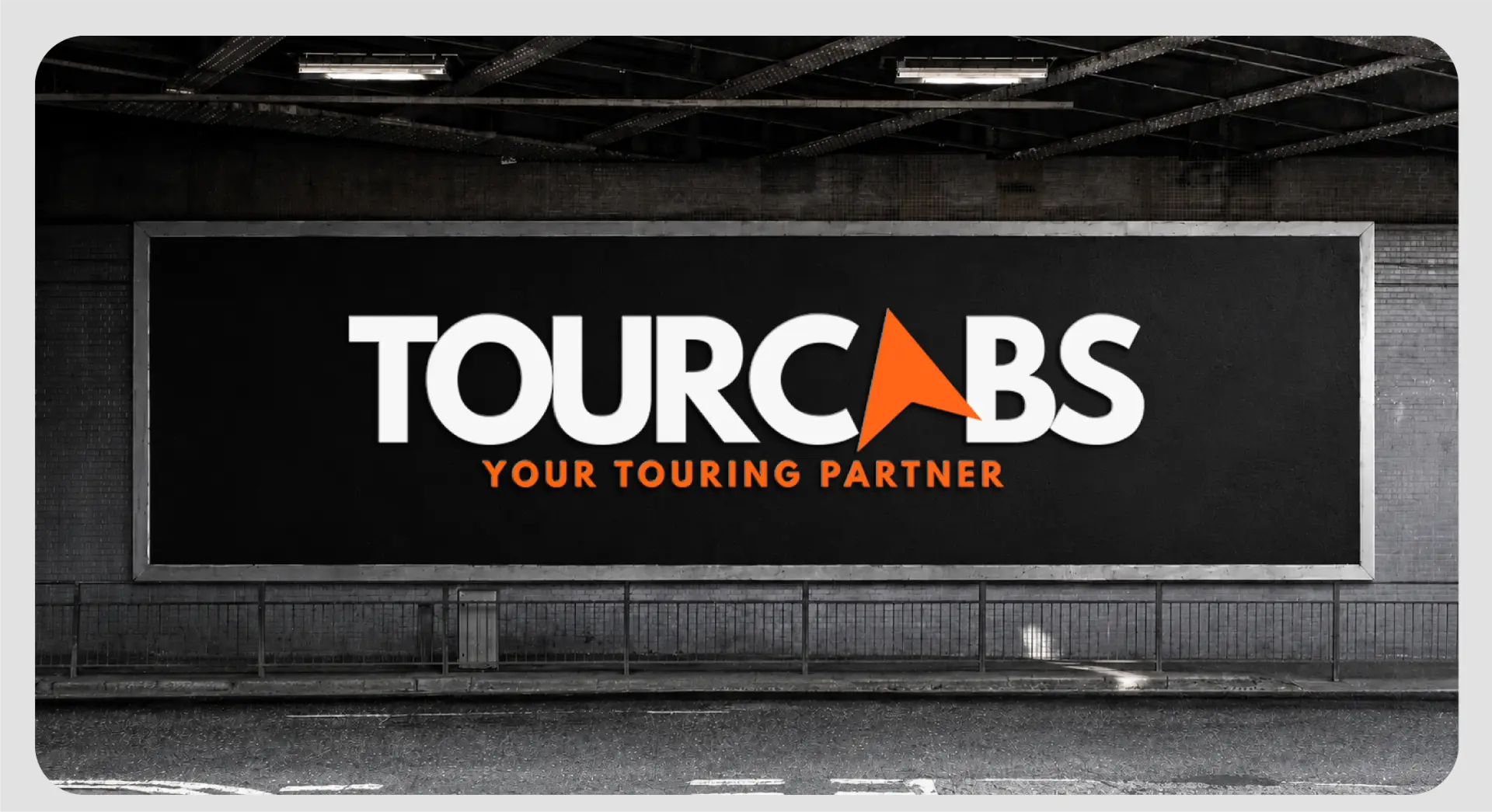
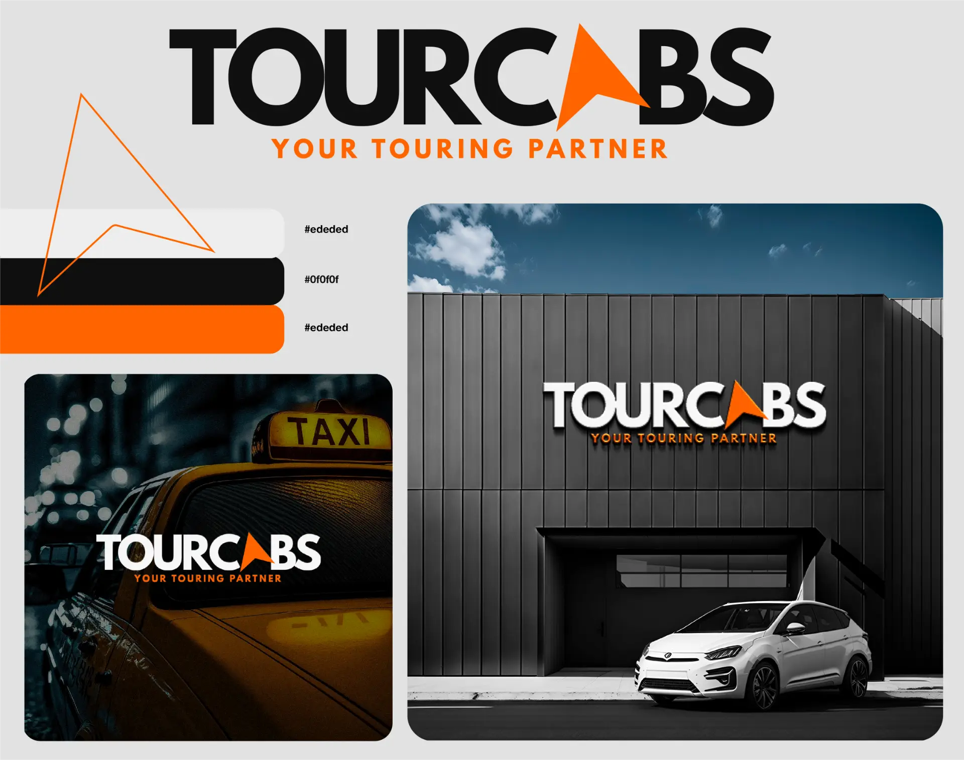
The identity combines a bold, contemporary wordmark with a customised compass/arrow-inspired symbol integrated into the lettering. The symbol represents direction, movement and the journey ahead, making it highly relevant to a touring and cab service. The orange and black colour palette creates a strong, energetic and confident personality, while the tagline reinforces the brand's role as a dependable touring partner.
- 03
Delivery
Custom wordmark with integrated travel symbol, orange, black and white brand colour palette, compass/arrow-inspired brand element, primary, dark-background and orange-background logo variations, tagline lockup: 'Your Touring Partner', and an adaptable identity for cars, vehicle branding, uniforms, booking platforms, social media, signage and marketing collateral.
[ Next project ]
Petrolos Drive ↗